Themes
Make it look like yours. Pick a family (the palette) and an appearance (light or dark), and everything moves together — text, code, callouts, minimap, and the icons — because every theme fills the same semantic token contract, checked when the theme CSS is compiled at launch. Each family's font is fetched from Google Fonts the first time you choose it, rather than bundled.
From the user side, themes are simple: open the theme picker, tap a family, pick an appearance, and the app updates immediately. Under the hood every family covers the full --lt-* token set, names the icon set it wears, and has its font loaded from Google Fonts the moment you switch to it.
Families
Pick a family in the theme picker. Fifteen ship free and six more are earned with seeds in the Grove, listed alphabetically; a family you have not earned yet stands in the picker dimmed, with its price in seeds, and pressing it opens that family in the Grove. A fresh install opens on Random family with a Daylight appearance; Fern is the fallback family if a saved choice can't be read. To see them rather than read them, open leaftext.com/gallery.html — every family drawn on one page, in light and dark, along with every color, icon and part of the interface. Each family is also a plain Markdown file that opens with a screenshot of its own palette — browse those in the themes gallery, which shows that preview plus a light-vs-dark swatch table per family, or open one below:
| Family | Palette | Icons |
|---|---|---|
| Amaranth | Clean light/dark base ramps with a violet accent | Heroicons |
| Arabica | A coffee palette — creamy latte light, dark-roast espresso dark — with an AnuPpuccin mauve accent | Remix |
| Bloodleaf | Blood-red veins on a white ground — an over-exposed white light with a red accent and a sky-blue second hue, against a blue-black night dark | Remix |
| Camellia | A rose palette — blush paper and wine ink light, deep plum dark — with a camellia-pink accent and Cormorant Garamond headings | Phosphor |
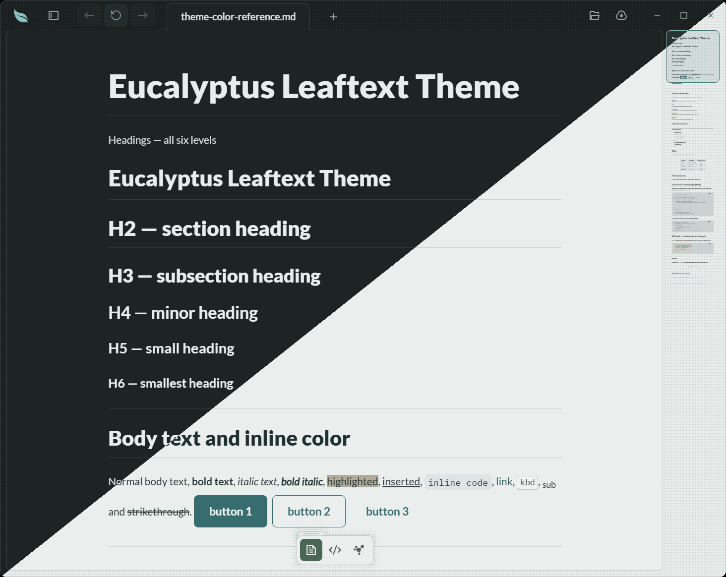
| Eucalyptus | A teal palette — cool blue-green paper light, near-black blue-green dark — with a eucalyptus-teal accent, set in Lato | Remix |
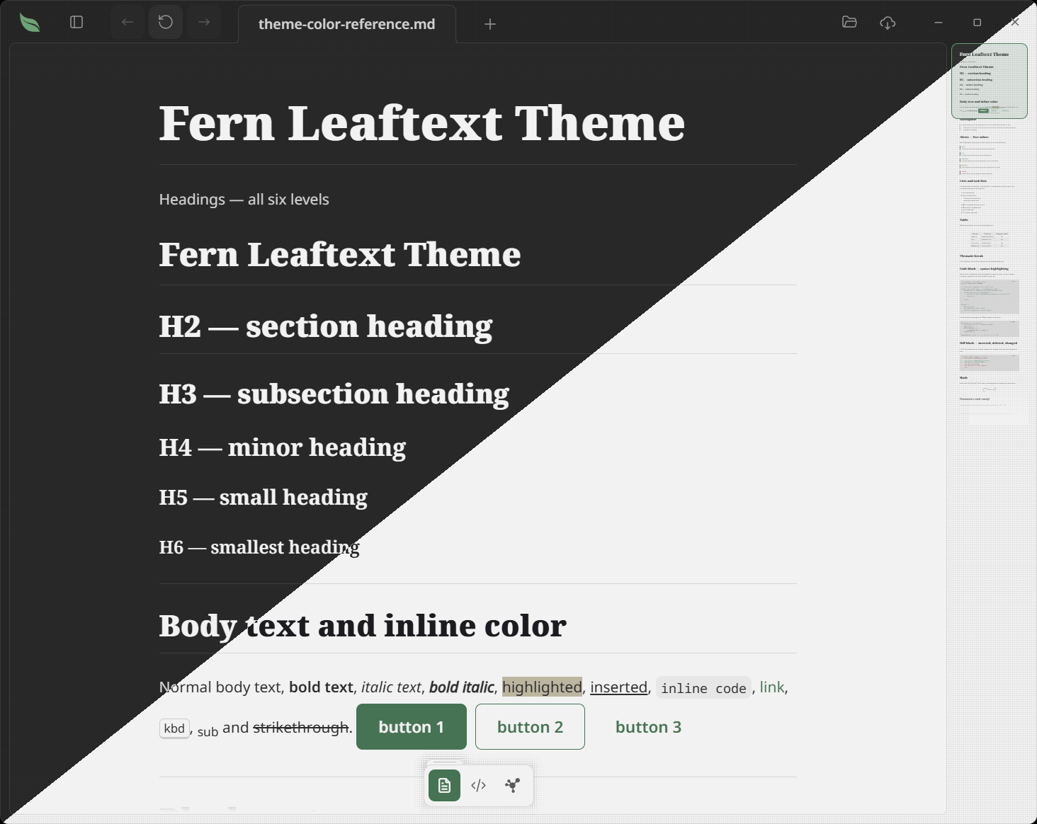
| Fern | Fallback family. An Amaranth-based palette with a fern-green cast | Tabler |
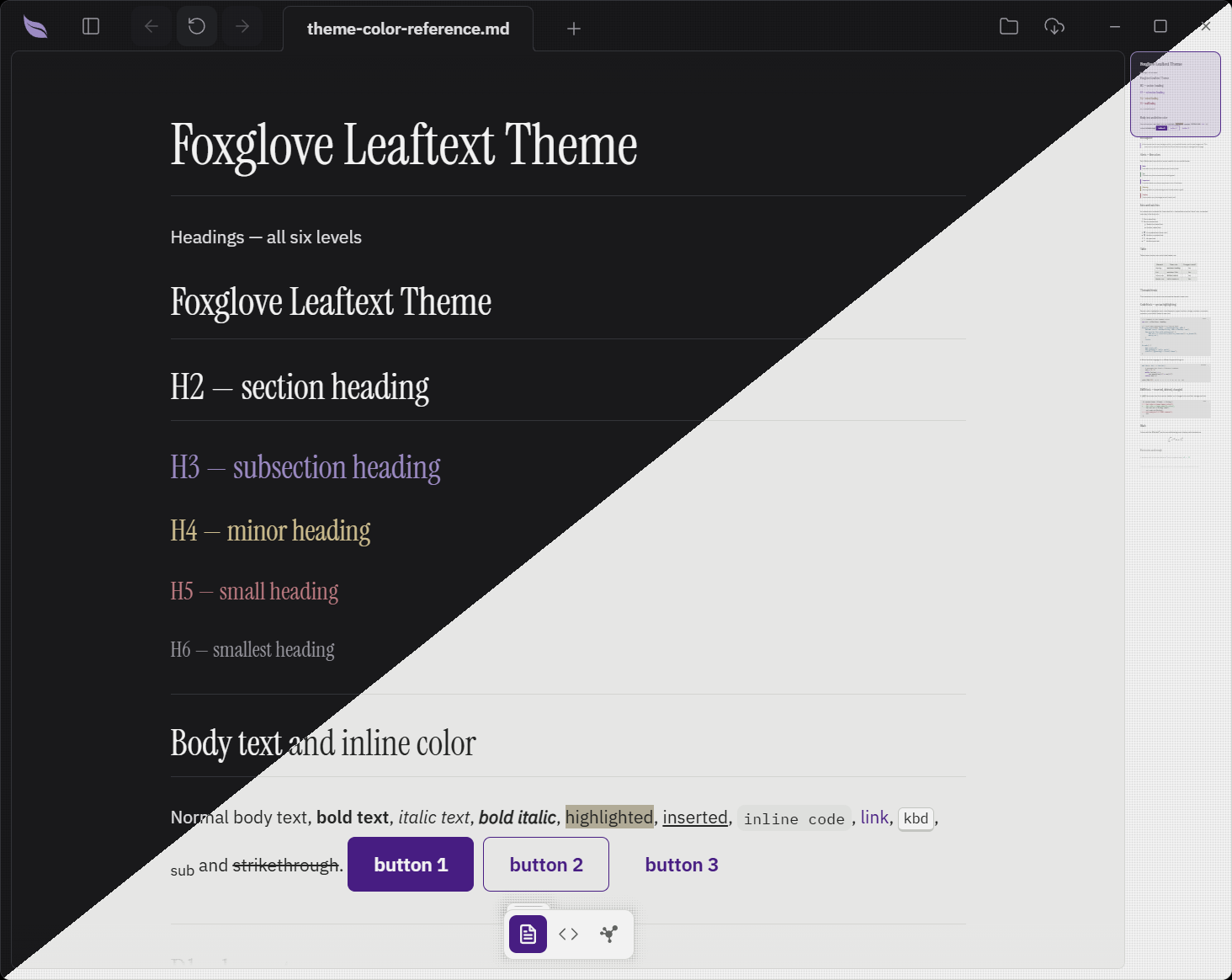
| Foxglove | A printed-report palette — warm paper light, the darkest ground in the picker for dark — with a violet accent and Instrument Serif headings | Feather |
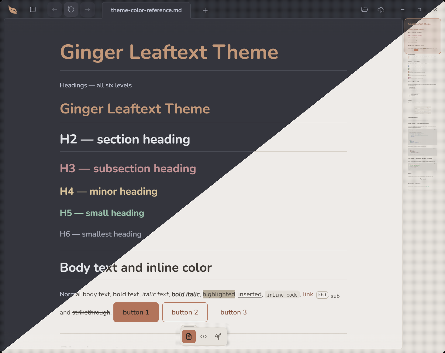
| Ginger | A warm palette — cream light, cool slate dark — with a ginger-orange accent | Tabler |
| GitHub | GitHub's light/dark palette, in its own system-font stack | Feather |
| Goldenrod | A stark black-and-gold palette — honey-on-white light, near-black dark — with a golden-yellow accent | Lucide |
| Halcyon | A calm, clean palette with one blue accent and a cool blue-gray dark mode | Heroicons |
| Ivy | A terminal palette set in monospace throughout — green ink on near-black dark, green-bar paper light | Feather |
| Nightshade | The classic Dracula palette (light "Alucard" and dark) | Phosphor |
| Pippin | A crisp, macOS-style palette — clean neutral grays with a system-blue accent | Lucide |
| Sage | A neutral grayscale palette with a muted-blue (Minimal-style) accent | Leaftext |
A sixteenth picker entry, Random, is a preference rather than a palette — see Random.
Previews
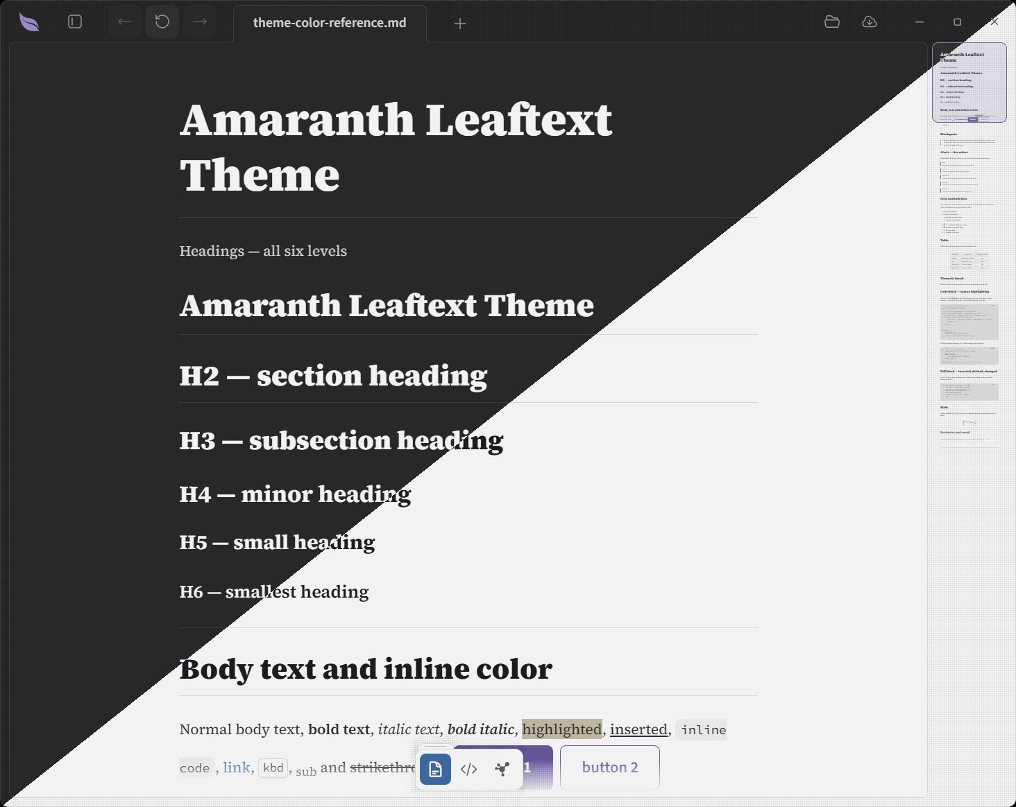
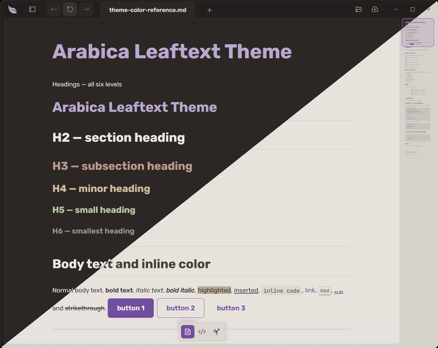
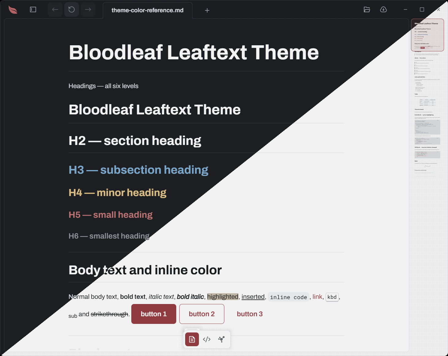
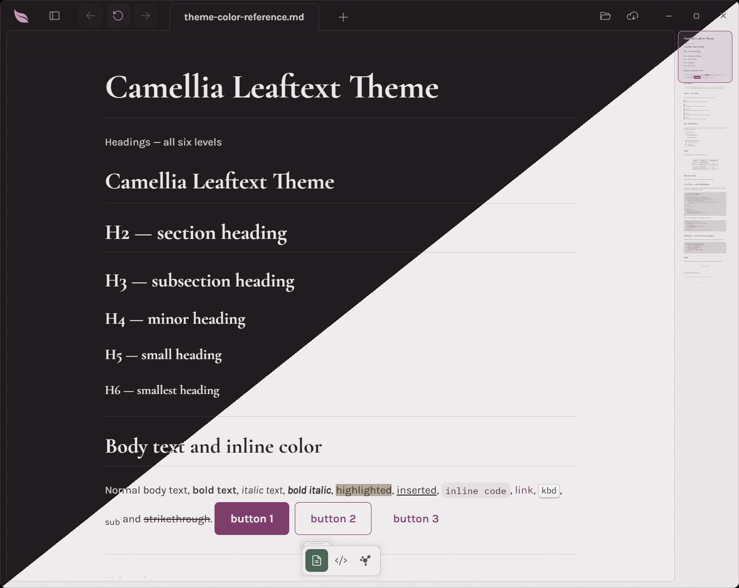
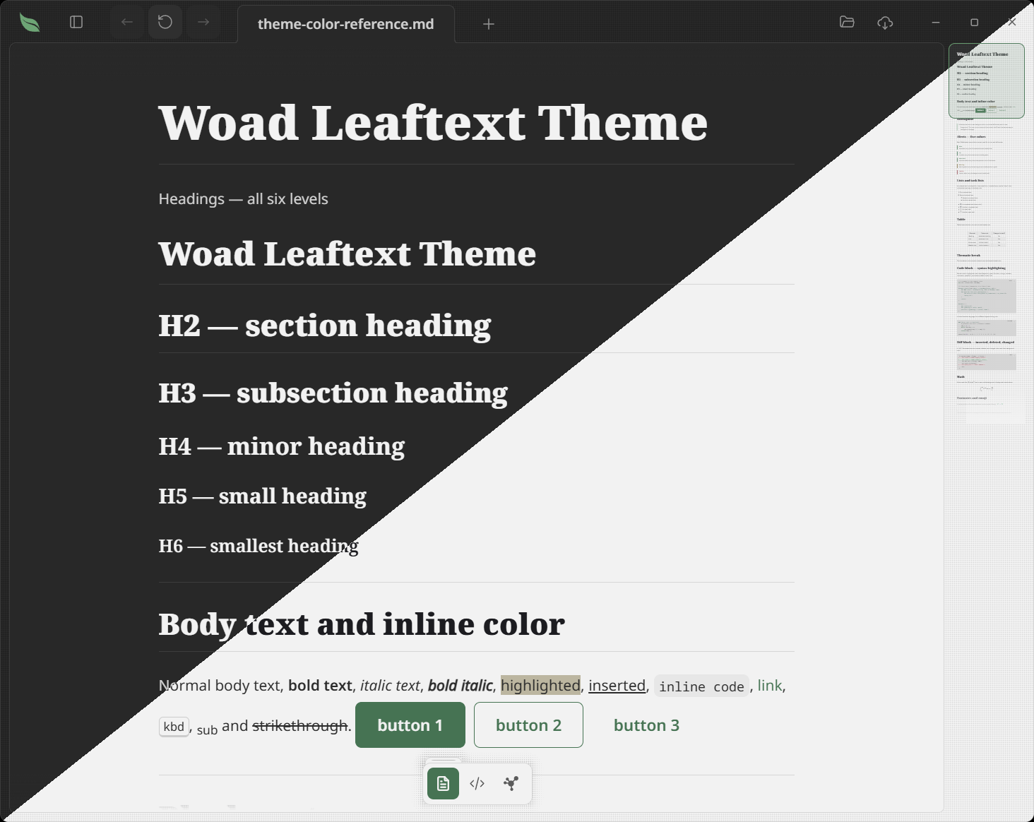
Every family rendering the same reference document, split diagonally so the light variant sits above the dark one. These are the previews each family file carries at the top.
Amaranth
Arabica
Bloodleaf
Camellia
Eucalyptus
Fern
Foxglove
Ginger
GitHub
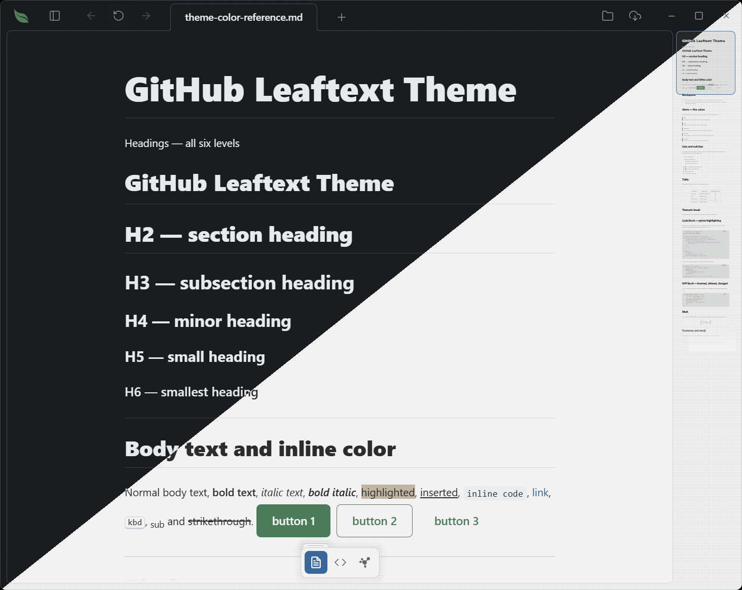
Goldenrod
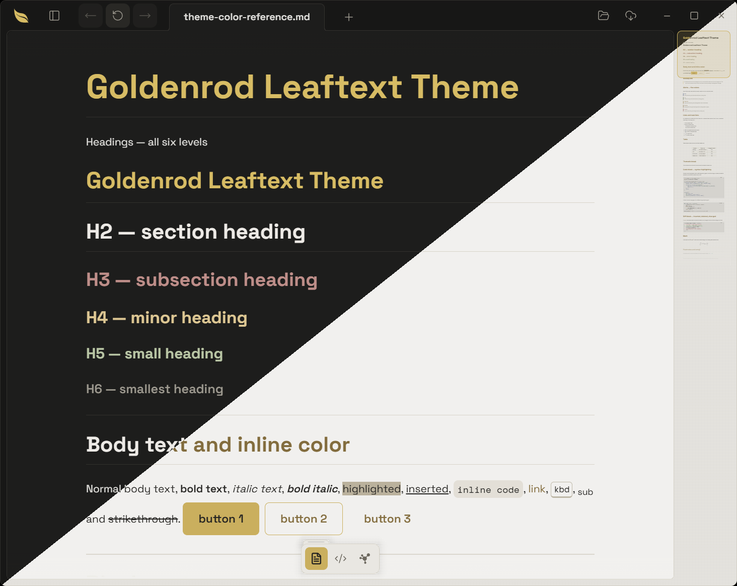
Halcyon
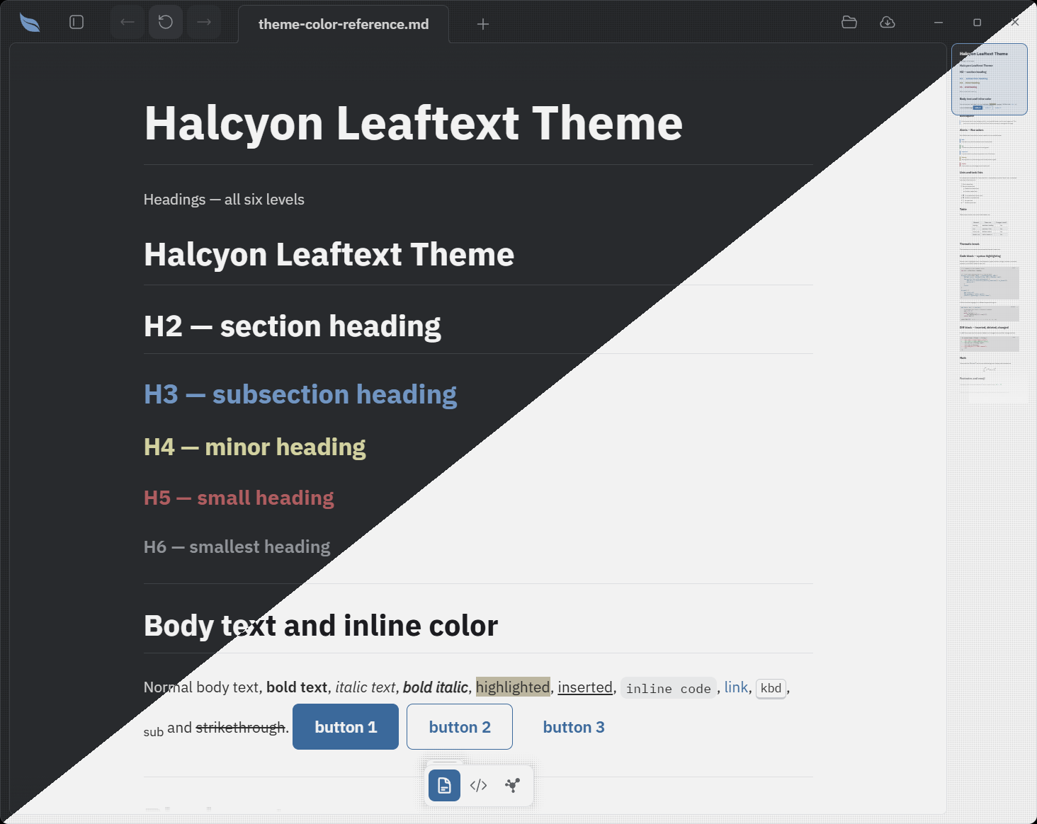
Ivy
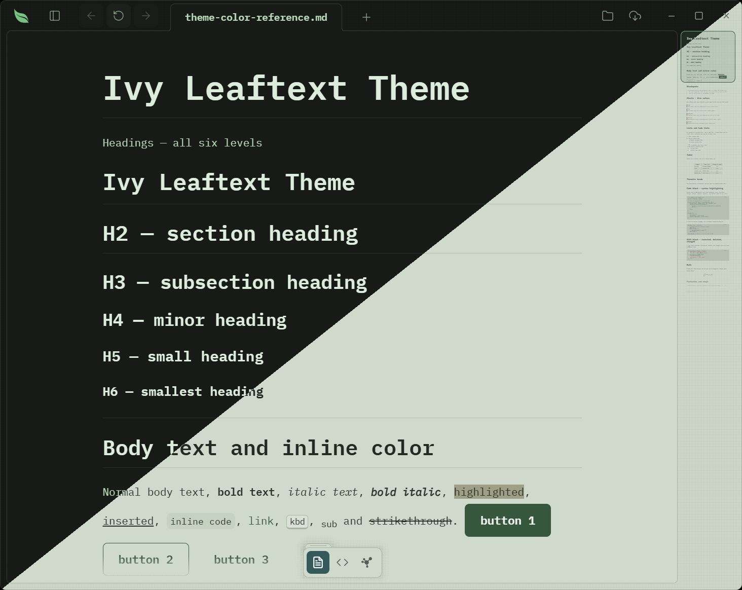
Nightshade
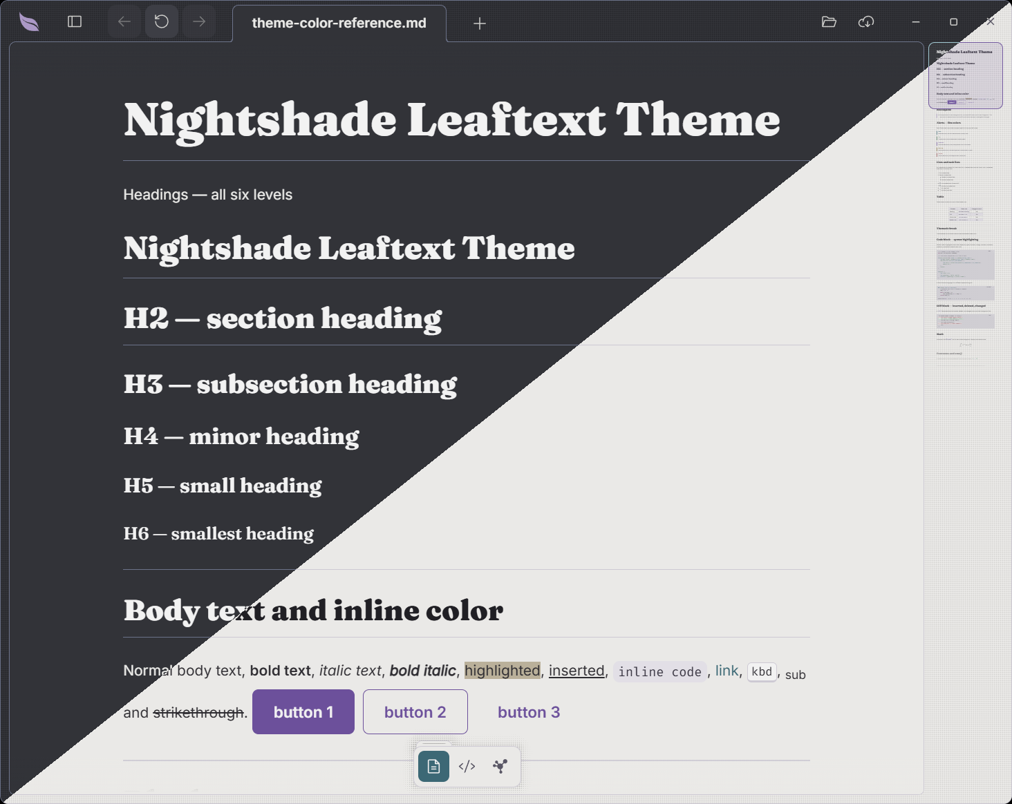
Pippin
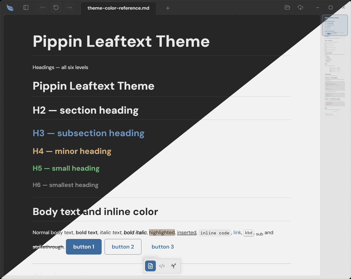
Sage
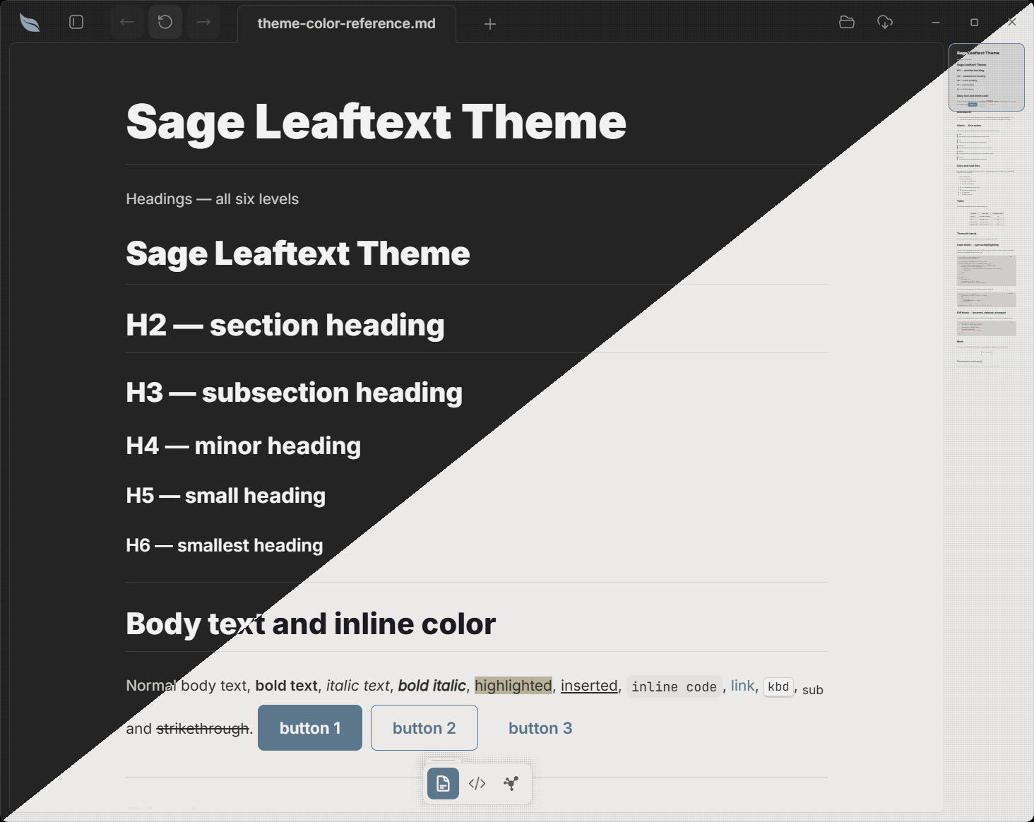
Earned families
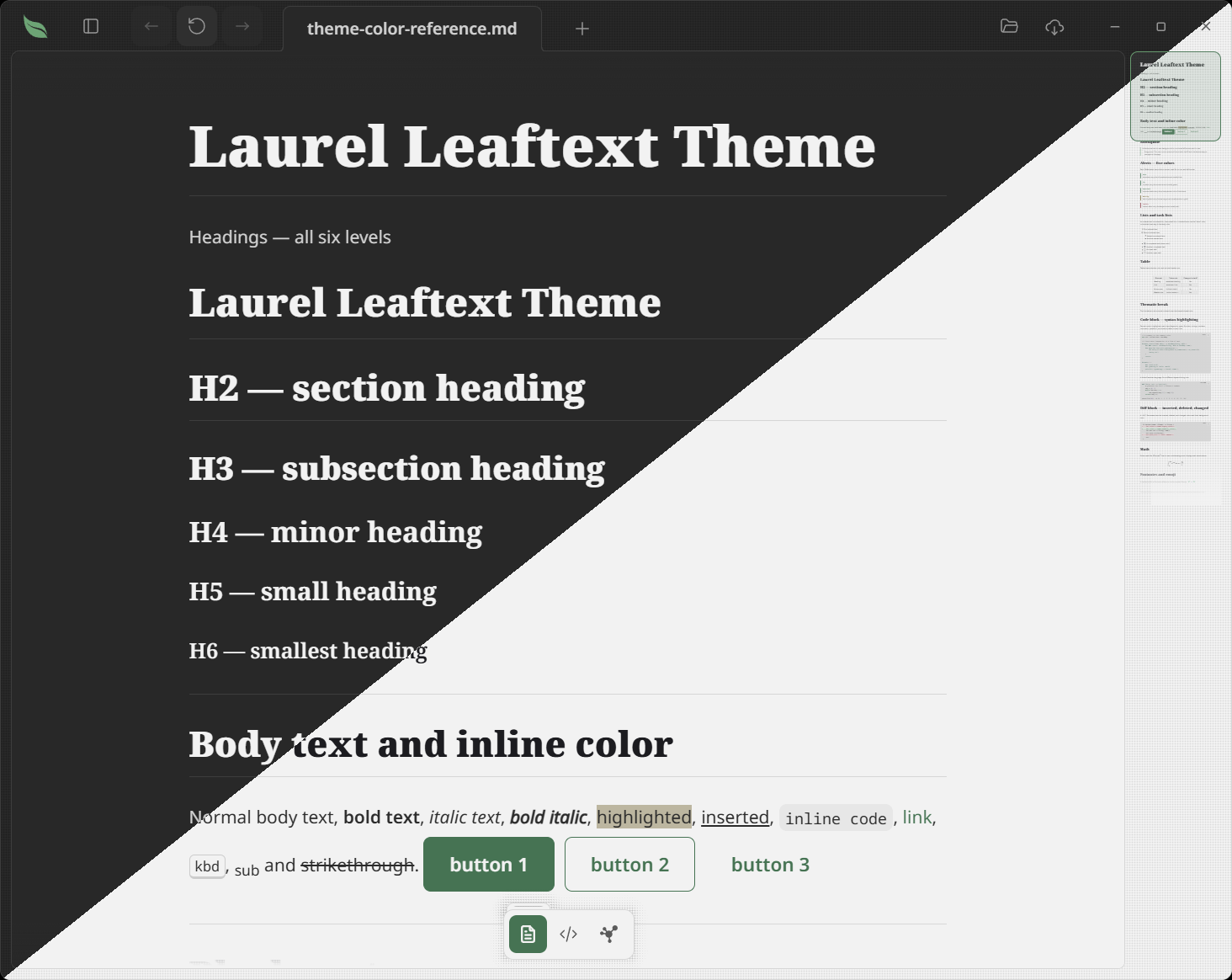
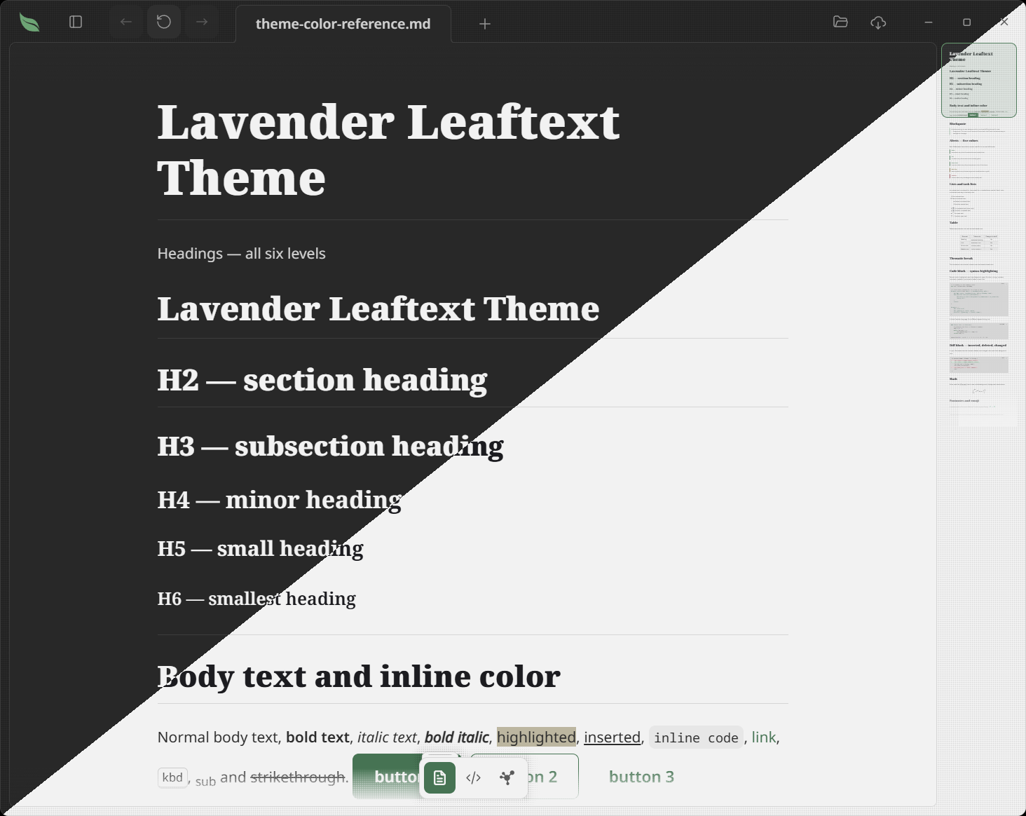
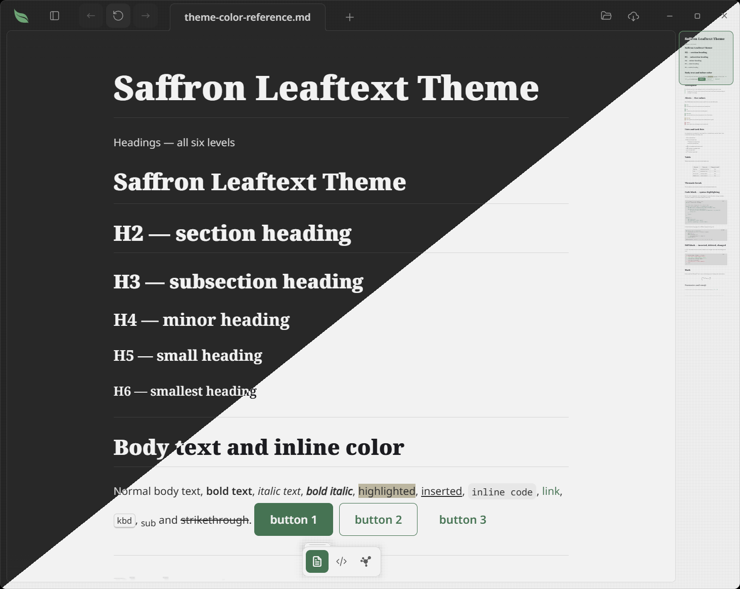
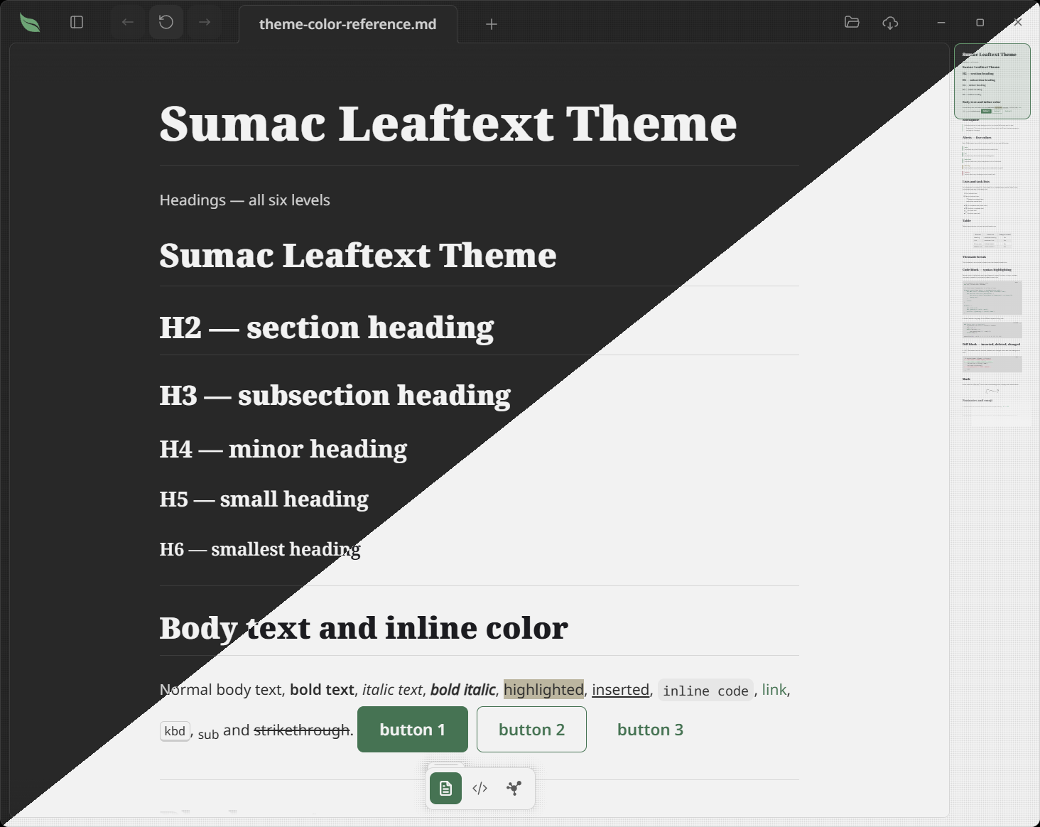
The six one-color families are bought with seeds in the Grove's Foraging area. Until one is yours, its card in the picker is dimmed and shows its price, and pressing it opens the Grove's Tree tab on that family; once bought, it is worn like any other.
Birch
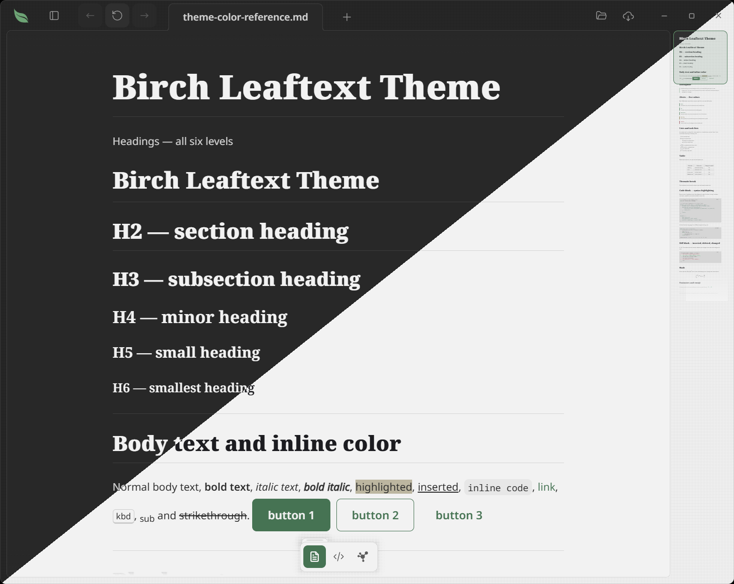
Laurel
Lavender
Saffron
Sumac
Woad
Random
The last entry in the theme picker is Random. It is not a palette; it is a preference that draws a concrete family at each launch, so the app opens in a different theme every time. The draw is a no-repeat cycle: every family shows once before any repeats, and when the cycle resets it avoids immediately repeating the family you just saw. The families already used in the current cycle are remembered across restarts (saved as theme_random_used in settings.json), so quitting and relaunching keeps the rotation going rather than starting over. The picker keeps showing Random as selected — the concrete family it resolved to for this session drives the actual colors. While the picker is open, the Random card previews the pool it draws from: it morphs through every theme's colors and font, one every half second, with only its name staying "Random". The preview rests while another app is in front and resumes when you return with the picker still open.
Appearance
Each family has a light and a dark variant; the Appearance control picks which:
| Appearance | What it does |
|---|---|
| System | Follows the OS light/dark preference, updating live |
| Light | Forces the family's light variant |
| Dark | Forces the family's dark variant |
| Daylight | Light between 09:00 and 18:00 local time, dark otherwise |
Model
flowchart LR
    A[Family] --> C[Theme source]
    B[Appearance] --> C
    C --> D[Semantic tokens]
    D --> E[Reader UI]
    D --> F[Code blocks]
    D --> G[Alerts]
    D --> H[Minimap]
Choose
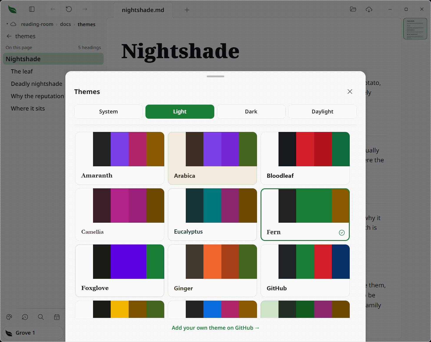
Press the palette at the foot of the library pane to slide up the theme picker. It lists every family as a preview card — plus Random at the end — with an Appearance control (System / Light / Dark / Daylight) at the top. Each card wears its own theme: the theme's paper and ink, a strip of five swatches (background, text, brand, and two code colors), and the theme's heading font, all following the current appearance. Changes apply immediately and are saved as theme_family and theme_mode in settings.json (see Settings). Close the picker with its close button, by clicking outside it, with Escape, or by dragging the grab bar at its top downwards — the same bottom sheet the glossary uses.
Fonts
Leaftext does not bundle fonts. Instead, the active theme's font is fetched from Google Fonts when the theme activates, and the WebView caches it on disk so later launches are instant:
- Each family carries its own type: Fern uses Noto (Sans/Serif/Sans Mono); Nightshade pairs Fraunces headings with Inter and Fira Code; Halcyon uses IBM Plex Sans/Mono; Amaranth uses the Source family, and sets its documents in Source Serif 4 — headings and paragraphs alike — while its own buttons, tabs and panes stay in Source Sans 3, with Source Code Pro for code; Sage uses Inter with JetBrains Mono; Arabica pairs Rubik with JetBrains Mono; Goldenrod pairs Space Grotesk with Space Mono; Ginger pairs Nunito with Inconsolata; Pippin pairs DM Sans with DM Mono; Bloodleaf pairs Archivo with Roboto Mono; Ivy sets every word in IBM Plex Mono, headings included; Foxglove sets Instrument Serif headings over IBM Plex Sans and Mono, and since Instrument Serif comes in one weight, every heading level draws at that weight and is told apart by size alone; Eucalyptus sets Lato over IBM Plex Mono; Camellia sets Cormorant Garamond headings over Karla, with IBM Plex Mono for code.
- The GitHub family is the exception: it uses your OS's native font stack (like github.com) and fetches nothing.
- Switching families swaps the font link, so the font changes with the theme.
- The theme picker is the exception to loading only the active font: while it is open it loads every theme's font so each card shows its real type, then drops them all on close, so the app never carries them at rest. A card keeps the app font (and shows a spinner) until its own font arrives, then swaps.
- Every font stack lists system fallbacks, so text is readable immediately while the web font loads — and stays readable offline, falling back until you have loaded the font online once.
Icons
A family brings its own drawings as well as its own colors. Switch family and the back arrow, the folder, the padlock and every other control in the window change with the palette — there is no separate icon setting, and nothing to pick.
Seven icon sets are drawn on, and the Icons column in Families says which one each family wears:
| Set | Where it comes from |
|---|---|
| Leaftext | Drawn for this app. Sage wears it |
| Feather | GitHub, Ivy, Foxglove |
| Lucide | Goldenrod, Pippin |
| Tabler | Fern, Ginger |
| Remix Icon | Arabica, Bloodleaf, Eucalyptus |
| Phosphor | Nightshade, Camellia |
| Heroicons | Amaranth, Halcyon |
The drawings ship inside the app, so nothing is fetched when you switch. Where an outside set has no drawing for a control, that control keeps Leaftext's own — a set is never partly blank. Diagrams are deliberately left out of this: a Mermaid diagram takes the theme's colors but always the same icons, so a document looks the same to everyone.
Every drawing, under every set, is on leaftext.com/gallery.html.
Tokens
The semantic token set covers:
- app chrome
- document text
- headings (a base color plus a per-level color for
h2–h6, so a theme can tint deeper headings) and links - blockquotes and alerts
- table bands and a grid that stays distinct from both neighboring row fills
- code surfaces and syntax colors
- minimap colors
- focus and selection styling
- the hover ink, plus separate foreground and ink colors for action and state fills
An action or state fill can be bright while its words and thin marks stay readable: the foreground prints on the solid fill, and the ink carries the same role over a page or panel. A family may omit either ink when its fill already reads on every surface, in which case Leaftext copies the fill value into the compiled theme. If a theme source misses any other required token, Leaftext fails the contract check instead of silently rendering with broken fallback colors.
What is under the pointer
Every fill under the pointer — a menu row, a toolbar button, a file in the library pane, a step in the folder path — is one wash, mixed from the family's own hover ink and left transparent. Because it is transparent it lightens a dark family and darkens a light one whatever it sits over, so a hovered row can never come out the same tone as the panel behind it. A family that says nothing about the hover ink gets its own quiet-text color, which is the normal case; Goldenrod names its own instead, so its hovers wash in gold rather than gray.
Diagrams
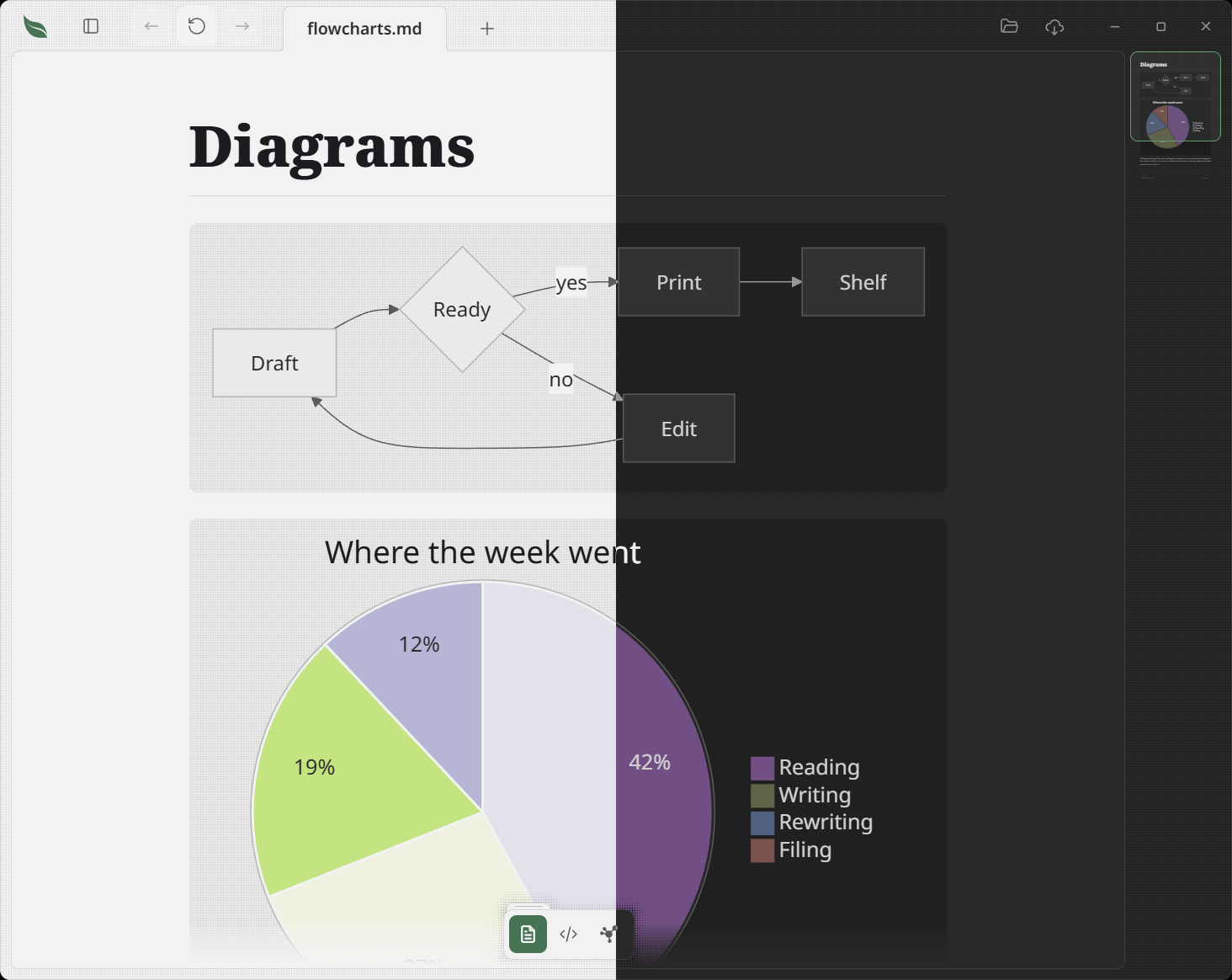
Mermaid diagrams are drawn in the theme's own colors, so every family themes every kind of diagram without saying anything about diagrams at all:
- Boxes and subgraphs take the theme's muted and sunken surfaces, with document ink for their labels — so a large flowchart reads as part of the page rather than a foreign object dropped on it.
- Arrows, axis lines and borders take the muted ink and border colors.
- Categorical colors — the twelve a pie chart, timeline, mindmap, kanban board or git graph cycles through — are the theme's primary hue turned around the color wheel, twelve steps of 150° so that neighboring items land on opposite colors rather than near-identical ones. Every entry is held to the same weight, not the same lightness, which is what lets one ink read on all twelve.
- State colors mean what they mean elsewhere in the app: a Gantt chart's active bar is the accent, its done bar the success color, its critical bar the danger color, and today's line the same.
- Labels are set in the face the theme reads its documents in, the same face as the words around the diagram.
- Text printed inside a colored fill — a Gantt bar's label, a plotted point — takes whichever of the theme's inks reads best on that fill, measured for contrast rather than assumed. A brand color is often a mid tone that neither white nor black sits comfortably on, so the ink is chosen per color and per theme.
Switching theme redraws the diagrams on the page: an SVG already drawn holds its colors as literal values, so the only way to recolor one is to draw it again. The ones still waiting as blocks are simply drawn in the new theme when you reach them. The little pictures on the flowchart sheet's shape buttons are drawings of the same kind and are kept for the session, so they go too: a sheet that is open draws them again in the new theme, and a shut one draws them the next time it opens.
Every theme is gated on this. theme_compiler_gates_diagram_colors_for_every_source re-derives the pairs a diagram makes across all 22 sources — labels at 4.5:1, arrows at 3:1, and every colored fill required to have a readable ink — so a palette that would make diagrams unreadable fails just verify rather than shipping.
One known rough edge: a mindmap can clip a long node label. Mermaid sizes that box from its own measurement of the text, and it comes out short of the theme's font. The other diagram types are unaffected.
Add your own
The theme picker links to the project on GitHub for making your own theme. A theme is pure data — a map of contract tokens to values, a font block and the name of an icon set — authored as a file under themes/ and compiled into the bundle, so it can be validated against the contract without injecting third-party CSS.
See them all
leaftext.com/gallery.html draws every theme on one page — all 85 colors, every icon, and every part of the interface — with a switcher for the family and for light or dark. It is built from the same files the app is, by just bundle-gallery, so it cannot show you a theme the app does not have.
CSS
The compiled stylesheet is assembled in this order:
- Compiled
--lt-*theme mappings (each family's palette, plus its font-family stacks) - The stylesheet's own
:rootblock — the radius scale, the type scale, the layout metrics: one value each, whatever theme is on - App CSS for layout and components
Every palette is pure data, compiled from the theme sources; the font files still load separately from Google Fonts per the active theme. The ordering keeps one stable semantic layer so the app can swap themes quickly.
The app's own copy carries every family's icon pack, since a theme can be changed at any moment. A page written out as a web page pins one theme and has no picker, so the stylesheet beside it carries that theme's drawings alone.
Windows
On Windows, Leaftext uses a frameless window with its own title bar rather than the native one, so nothing the OS draws sits above the app. The app bar doubles as the title bar: drag it to move the window, double-click to maximize or restore, and its right edge carries the minimize / maximize / close buttons, which take the same rounded hover chip as the other toolbar icons (close turns red instead of the accent color). They quiet with the rest of the window while another app is in front. Press F11 for full screen, with the taskbar, shadow band, edge and corner gone; the middle square becomes the way back out, then means maximize again in the ordinary window. The taskbar still shows the leaf icon outside full screen. The window has no border of its own and no system shadow: the app draws both, a hairline in the theme's divider color around a rounded surface, and outside it the same dot-grain shadow every floating surface in the app throws, curving round each corner on an arc struck from the window's own and at the weight it has along the sides, kept black on every family — a band falling on the desktop is read against whatever is behind the window, so it does not take the lighter shadow ink a light family gives the ones inside the window — so what separates the app from the desktop is drawn in the app's own language rather than the platform's. Where two floating surfaces overlap inside the window — a popup opened from the view bar, a link card over a menu — their shadows meet at one weight rather than darkening where they cross.
macOS
On a Mac the app bar reaches the top of the window too. The title strip goes empty and see-through, the page runs up underneath it, and three dots sit at the bar's left end where a Mac's always are — close, minimize, zoom, centered in the bar, with the mark inside each one appearing as you point at it. They are Leaftext's, not Apple's, which is why they take the theme: the close is the theme's red, the minimize its yellow and the zoom its green, so they change with the family like everything else on the bar. Drawing them is also what lets them fold into the chevron menu when the bar runs out of room, which Apple's could never do — they are pinned to the window, so the bar had to hold room for them whether it had any or not. All three quiet with the rest of the window while another app is in front, keeping their red, yellow and green at half strength rather than losing them. Press the green dot and the window goes properly full screen — a space of its own, the menu bar and the Dock out of the way, and a sideways swipe back to the desktop. Press it again to come back; the three dots stay on the bar in full screen, because Apple's return when you push the pointer at the top edge and ours cannot. Hold Option and press it to zoom instead, filling the room the menu bar and the Dock leave over, and drag empty bar space to move the window or double-click it to zoom, the same as on Windows. The cost of drawing our own dots is the green one's tiling menu: it has none. The window keeps its native frame but not its system shadow — that is the app's dot-grain band, the same one Windows gets, and it is gone in full screen where there is nothing behind the window to cast onto.